Reduce purchase cycle drop-offs with these tips for Shopify store checkout optimization.
The ultimate goal of any online business is to convince your customer to make a purchase and complete the transaction. The checkout experience is an important part of any e-commerce store and plays a huge role in this.
The Shopify checkout process can make or break your business. If your customers have a bad checkout experience, they’re likely to abandon their cart. Consequently, failure to address any of these issues in your own store could lead to lost sales and disappointed customers.
Convincing users to buy something online is not easy. In fact, according to a recent study from Invesp, the average conversion rate for online stores is just 2.68%. That’s a lot of wasted money!
So, if you want to increase your conversion rate, you need to try different approaches until you find the right one. A good start would be to start with your e-commerce checkout optimization.
In this article, we will share some tips on how you can optimize your Shopify store checkout for more conversions.
What does a Shopify checkout process ideally look like?
If you’re new to e-commerce, the checkout process can be daunting. But it doesn’t have to be that way. There are several things you can do right now to optimize your Shopify store checkout so it converts more store visitors into paying customers.
To optimize your Shopify store checkout, you need to make sure that it clearly explains all the details of your offer in a way that makes sense to your customers.
Ideally, your Shopify checkout process would have three main components –
Shopping cart page
This is the page where the shopper will add items to their cart, review them, and then proceed to checkout. The goal here is to make it as easy as possible for shoppers to complete their purchases without any confusion or delay.
Billing and shipping info
This is where shoppers will enter their billing information (name, address, etc.) and shipping details (shipping address, payment method).
You can also include an option for them to save their information for future purchases if you have an account login system set up.
Order confirmation
This is the last step before your customers confirm their orders and pay for them online. You can use this section to reiterate any important details from earlier in the process along with any additional information about delivery options or returns policy if necessary.
Reasons for abandonment during Shopify checkout
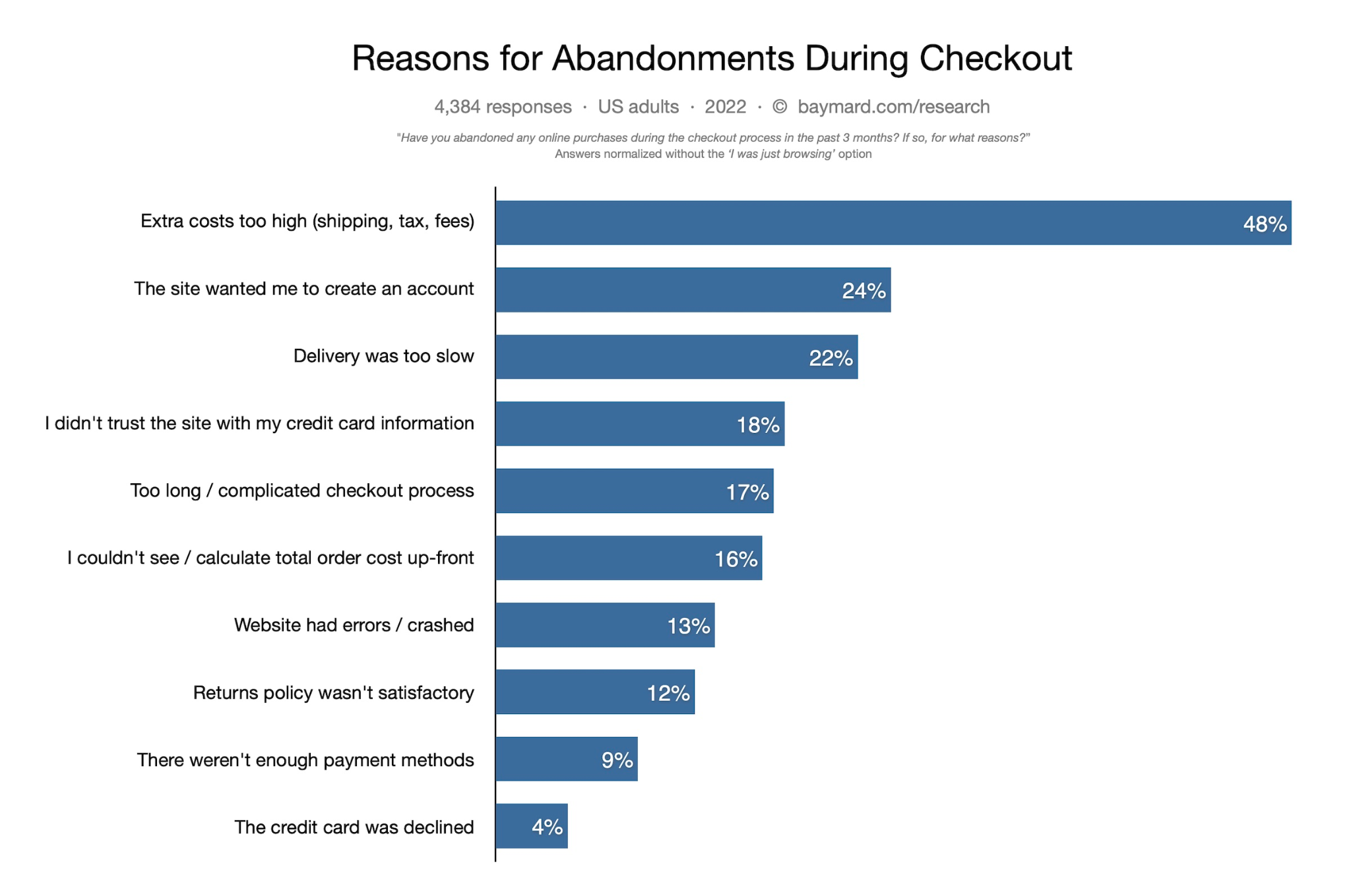
The first step in optimizing your Shopify checkout is understanding why customers are abandoning their carts in the first place. If you know why they’re leaving, then you can work on fixing those issues.
Here are some common reasons people abandon their carts –

Source – Baymard Institute
You can always improve your conversion rates, but it’s never going to be easy to create a perfect checkout experience. You’ll need to know what your goals are for the checkout process before you decide which features would be the most valuable for your customers.
Once you’ve done this, you can better decide where to focus your efforts when it comes to tweaking your checkout page. In the next section, we’ll cover a few tips to help you with your Shopify checkout process and conversion rate optimization.
Tips to optimize your Shopify checkout
The goal of the checkout process is to secure the sale. This means that you need to provide a seamless experience from start to finish.
Checkout pages are also the most complicated store pages to design, test, and then optimize. This is because there are so many elements that go into them.
Shopify checkout optimization is essential if you want to increase sales.
A well-designed checkout page will make sure customers don’t abandon their carts and provide them with an easy way of completing transactions. If you don’t optimize your Shopify checkout page, there’s a good chance that shoppers will leave without making any purchases.
Here are some Shopify checkout optimization tips to get you started –
1. Test your store speed – particularly checkout
You should always test your store speed to see how fast it loads, especially when it comes to the checkout page. You’ll see a big difference between a site that takes 1 second and one that takes 5 seconds.
This is because the longer it takes for someone to get through the checkout process, the more likely they are to abandon their cart and go buy something else instead of waiting around for 5 seconds longer.
2. Display checkout progress clearly
This makes it easier for customers to follow along with their order status as they go through each step in the checkout process.
If something goes wrong or there’s an issue during one part of the process, showing them where they are in the process will help them understand what’s going on – which could make them less frustrated if they have to wait longer than expected before they can complete their order themselves.
If you don’t show a progress bar, consider adding some kind of notification that tells customers what stage they’re at in the checkout process and how many steps are left before their order is completed.

3. Include personalized recommendations
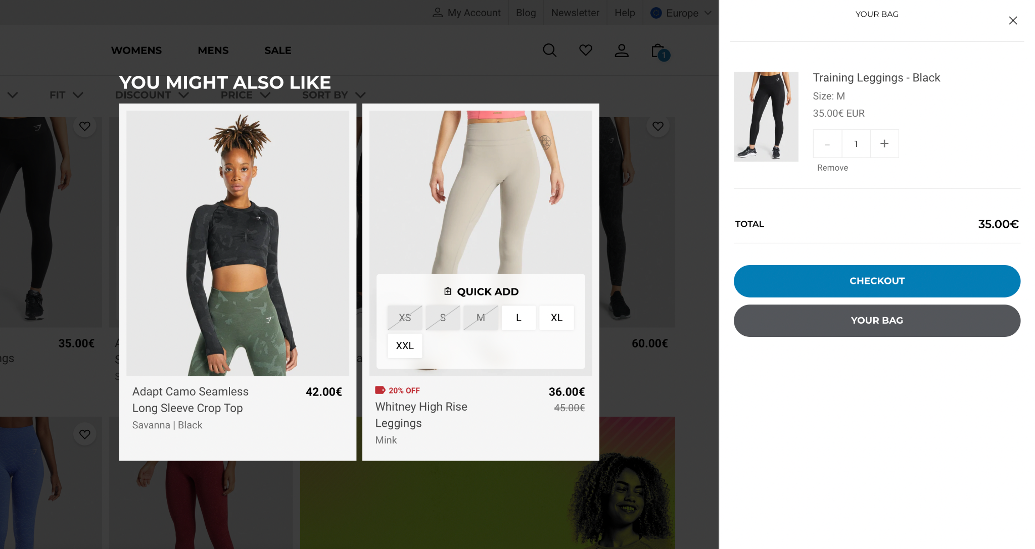
Personalization is important in all parts of e-commerce, and the checkout process is no different. By applying the same AI-based approach used to optimize product recommendations on your site to your shopping cart, you can increase the average cart/order value and conversion rate.
More importantly, the more techniques you implement to personalize your checkout process, the more personalized it will feel to users, which will lead to them feeling like they’re getting a superior experience and they’re more likely to complete their purchase.
Use dynamic product recommendations based on past purchases and browsing behavior to increase a user’s cart value even at the final leg of their shopping journey.
Personalized shopping cart recommendations can increase your sales drastically. In fact, 92% of online shoppers actually make a purchase based on their cart recommendations.

Also read: How To Use Product Recommendations At Different Stages Of A Buyers Journey To Increase Conversions
4. Add an exit-intent popup
An exit-intent popup is a small popup that appears when someone is about to leave your website. You can use them to capture information from your visitors before they leave or offer them an incentive to stay on your website.
Adding an exit-intent popup on your Shopify checkout page will give you insight into what makes customers abandon and leave their carts before they purchase. You can then use this information to improve and optimize other parts of your store.
5. Display trust signals – security badges and certificates
The aim of the checkout page is to get the customer to complete their purchase before they leave your store. But if a customer has doubts about the security of your site, they are likely to abandon their cart.
That’s why it’s important to display trust signals on your store – security badges and certificates that prove that you’re a legitimate business. This will help reassure customers that they can safely enter their payment details on your site.
These are usually visible at the top or bottom of a site, but you can also include them in your footer or sidebar.
6. Showcase customer reviews/ testimonials around the product added
This will show customers that others have bought this product, increasing trust and perceived value of your products. It also gives them more confidence in buying from you if they see that other people have purchased it before.
7. Integrate live chat
Live chat is a great way of interacting with customers, especially when they are in the process of checking out. You can chat with them and answer any questions they may have. This will reduce the number of abandoned carts, which means more sales!
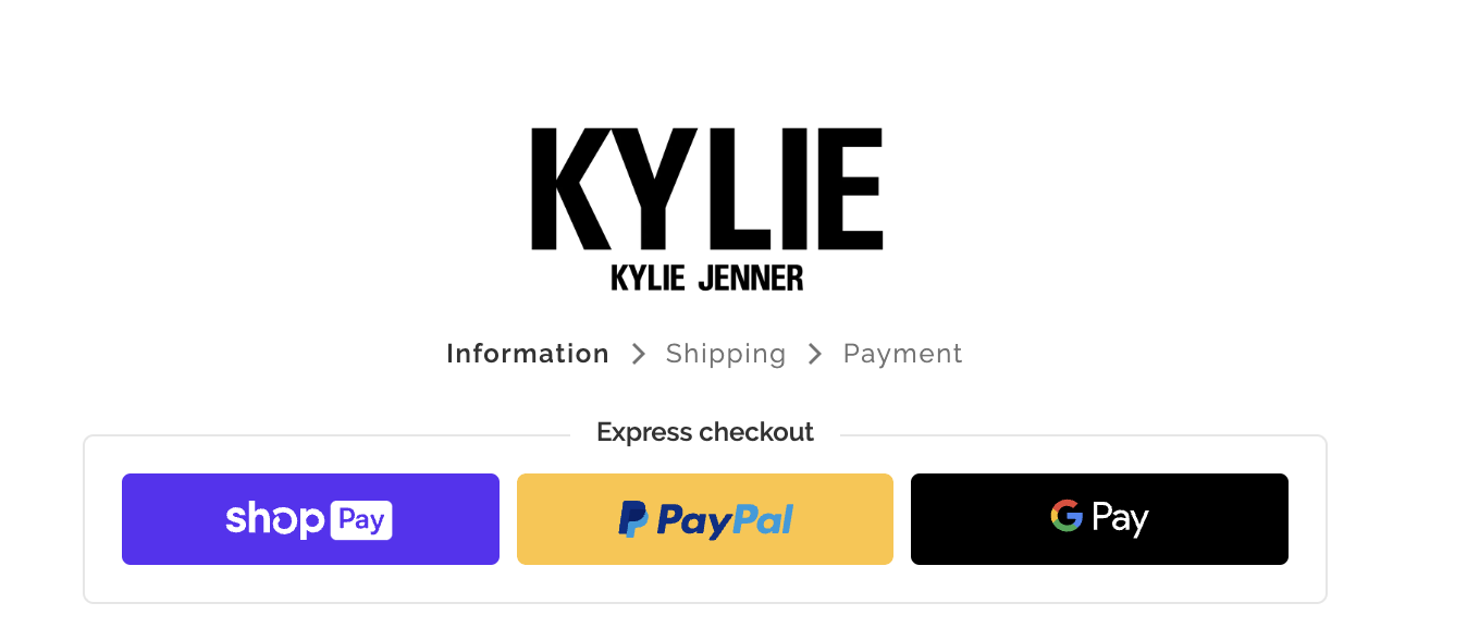
8. Display all payment modes available
19% of customers abandon their carts because there weren’t enough payment options.
To minimize cart abandonment on your site add and display as many payment modes as needed. This will help people choose the payment method that suits them best. If you accept only specific payment methods, you might lose potential buyers who don’t have one of these modes but would still like to buy from you.
Nevertheless, what payment methods your store should offer is highly dependent on your target audience and geographic locations.

9. Create FOMO and scarcity
Using labels such as ‘limited stock’, ‘running out soon’ or ‘only X left in stock’ will create a sense of urgency and scarcity which will result in more people completing their purchases faster.
10. Make your Shopify checkout mobile-friendly
Over 40% of online sales during the 2018 holiday season were made on mobile phones. This figure has gradually increased over the years. In the last 6 months, 79% of users have made an online purchase using their smartphone.
When people are buying on their phones, they expect a smooth and easy experience. If your checkout doesn’t work well on mobile devices, you will lose sales.
Your mobile users will typically have a completely different experience than desktop users. Hence, you need to ensure that they should be able to do everything they need to do in order to complete their purchase without having to scroll or squint at tiny buttons.
If customers are shopping on their phones or tablets, they’ll be doing all of their browsings on a small screen with no mouse or keyboard. So make sure that your Shopify checkout form is mobile-friendly by using larger buttons, readable text, and simple fields (like shipping address).
This will increase conversions without adding complexity to a small screen.
11. Don’t make customers create an account to checkout on Shopify
If you require your customers to create an account before completing checkout, then they will have to go through two steps – creating an account and then checking out.
This will add friction to their experience and may lead them to abandon their cart altogether.
While asking users to create an account is great because it allows you to connect with them and send them automated emails about their purchases or any future offers on your store, it is not necessarily great when they’re checking out. It will only slow down their purchasing process and make them more frustrated, which is something that no one wants!
Instead, consider using the “Continue as Guest” option so that customers don’t have to sign up for an account just to buy from you. You can connect with them later when they return for more purchases or sales promotions if you like. Or you could even add an option to subscribe to your newsletter right on your Shopify checkout page.

Conclusion
The checkout experience is an important part of any e-commerce store. Your potential customers will only give you a few seconds to convince them to purchase your products, and clear and thoughtful design elements can help increase conversions.
Remember, optimizing your Shopify store to deliver the best results is always an ongoing process.
With these techniques in mind, you should be able to smoothly execute your e-commerce checkout optimization so customers can complete their purchases with greater ease. The next time you review your checkout process, keep the above information in mind and you’ll likely see some positive changes.
Wiser is your tool for improved visibility into eCommerce retailers—covering pricing, availability, ratings, reviews, and promotions.
Book a free consultation today to discuss your business needs and how we can help you deliver the results you want!

